Colour is everywhere, a non-verbal form of communication that decorates everything we see. Colour urges us to act, it compels us to feel, and it tells us a story, unlike any spoken word. We are drawn to colour when it’s skillfully used.
We're going to look at colour theory and some of the applications it can have for creative classroom projects. It will help give your students an understanding of how colour is used to invoke sense and emotion, and how it can represent the values of an organization or a designer.
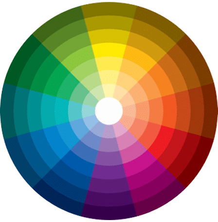
The Colour Wheel, created by Sir Isaac Newton, has become one of the most valuable tools for designers of marketing and media. It’s your best colouring friend.
Some of the basic terms of colour theory are listed here, along with some visual examples. Explore them on your own using the links to these resources:
Any marketer or artist understands a need for consistency in colour. It’s also crucial to move beyond simply using what looks good. Your students can learn to use colour strategically to invoke emotions that will then give rise to taking an action. Here are some ideas of what particular colours represent in our hearts and minds, and how they can be used.
Positive: tranquility, loyalty, intelligence
Negative: coldness, fear
Marketing: dependability, strength
Positive: love, energy, passion, strength
Negative: anger, danger, heat, injury
Marketing: youth, boldness, action
Positive: joy, intellect, creativity
Negative: irresponsibility, instability
Marketing: warmth, clarity
Positive: wealth, fertility, growth, healing
Negative: envy, guilt
Marketing: health, growth, serenity
Positive: royalty, luxury, spirit, ambition
Negative: mystery, dejection
Marketing: imagination, wisdom
Positive: security, reliability, solidity
Negative: gloom, sadness, despair
Marketing: practicality, timelessness
Positive: playfulness, femininity, joy
Negative: weakness, immaturity
Marketing: compassion, caring
Positive: courage, confidence, friendship
Negative: ignorance, fatigue
Marketing: cheerfulness, confidence
Positive: purity, innocence, light
Negative: coldness, distance
Marketing: calmness, neutrality
Positive: protection, formality, class
Negative: darkness, evil, death
Marketing: elegance, exclusivity
Colour relates to the balance between the mind, body, and emotions. When we use colour in media and marketing design, the right combinations can really help make our intended statement come through. These combinations are called “schemes.”
Properly-used colour schemes are at the forefront of every design’s specific appeal and effectiveness. They communicate the message we want to send and invoke the feelings that inspire opinion and action. Colour is carefully considered in any design. The following examples are five basic and commonly-used colour schemes you see in everyday life.
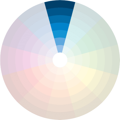
The Monochromatic scheme uses one colour of different shades and depths. This colour scheme always looks good because it’s essentially shades of the same hue, just used to various effects. This is a uniform and clean colour scheme that has remarkable versatility.
The Complimentary scheme utilizes two colours that are across from each other. This colour scheme presents the risk of being too visually jarring if not managed correctly. If done right, though, it creates a great sense of harmony and also colour compliment. This is a great scheme to use if you really want something to stand out.
The Triad scheme uses three colours from equidistant points on the colour wheel. The reason this scheme works so well with media and marketing is because of its “harmonious contrast.” This means it uses colours that are in high contrast to each other, and yet such a combination retains a vibrant balance in its palette.
The Analogous scheme uses colours that are adjacent to each other on the colour wheel. With this scheme, usually, one colour is chosen as the dominant shade. The second supplements it, and the third is chosen as an accent or highlight. This is a comforting scheme that’s quite pleasing to look at. Having enough contrast is important here.
The Tetradic colour scheme has four colours arranged into pairs or an equidistant group. Often in this kind of colour scheme, one hue is chosen to be the dominant one. When it’s used for any marketing and media purpose, the idea is to catch the eye and offer a sense of playfulness and fun. In other cases, it can be bold and sometimes rebellious.
Now you and your students can learn to master the essentials of colour theory in World of Colour: Colour Theory in Marketing and Media.
This guide is full of practical knowledge about colour theory and its applications, and will guide you and your students as you explore the power of colour.
This colourful and engaging guide will help you:
Download World of Colour: Exploring Colour Theory in the Creative Classroom and bring some colour into your classroom.